First month down, 11 more to go.
It been a busy month for us, alongside our own official launch, we been working on a few rebrand projects for customers, and launched the fantastic new website for Nationwide Traffic Solutions. Here’s a little spotlight summary from January.
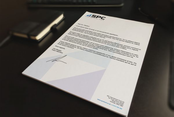
01. As part of a huge E-Commerce website development project, we’re working with SPC Used Food Machinery to refresh their existing website and company image. The 1st stage, company branding, is already approved and has gone to print. One unique way in which we use the logo was to create them a run of bespoke 4-way utility keys to hand out to customers and at marketing events.
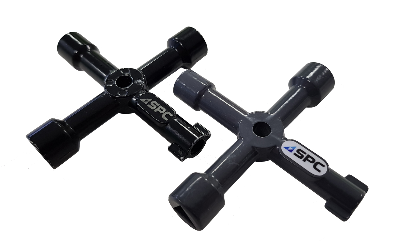
Partnered with our print suppliers, we were able to offer both full colour stickering on the keys and laser engraving. A product we have never delivered before but a fun and successful learning curve nonetheless that we will carry across to the next bespoke challenge that comes our way.
02. The Nationwide Traffic Solutions team approached us late 2017 for a complete website overhaul. This would be the second website we have created for NTS, and given the reaction for the initial website, they knew they could trust us to product the goods for a second time running.
When we worked on the initial site in 2015, NTS wanted to stand out and do something different. We built them a website with a dark colour scheme. You don’t see many of them, but low and behold as soon as that website went live, their competition slowly followed suit which we we’re surprised to see. I mean, what a compliment!
Now we plan to set the trend again with a super clean, super functional website built around the principle that less is more. This website is so easy to navigate, and helps visitors get the information they need with minimal effort. The reaction has already been very positive and we look forward to continuing our relationship with Nationwide Traffic Solutions for years to come.
Take a look at the site here (www.nationwidetrafficsolutions.co.uk) and if you think your website needs the same treatment, you know where to come.
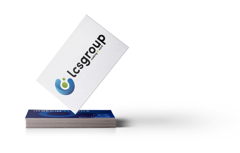
03. Another rebrand, but this one a bit closer to home. Our parent company LCS Group has been through the studio for a refresh this month. LCS had its previous logo 5 years, from the word go it was difficult to work with on anything other than a plain white background and it was created by an external agency so didn’t truly represent who we are. We took the old logo, and brought it up to speed with a modern design that will be versatile across any platform.
Over the coming weeks you can expect to see this logo consistent across all media from LCS Group, from their website, to their letterheads, business cards, signage, company PPE, email correspondence. It’s a complete overhaul from Align Studio.
That’s a wrap for this month, plenty to be on with in February. We’d love to hear your comments, feedback and any suggestions for future content. If you have a project in mind for next month and need our help, just drop and email to hello@align.studio.